


When an organisation like the Arts Council considers changing its identity you know it is going to be headline news. And it was.

The story of the Arts Council?s new logo was given a half page in the Times complete with cartoons and featured on the front page of the Telegraph. There was even a very funny piece in Private Eye. But for me, writes Liz Martell, the high point was making GMTV?s ?and finally? slot, with the added glory of Penny Smith saying how much she preferred the new logo.
From the beginning we were all aware that as a well-known organisation any change to our identity would attract comment. Our logo appears in arts advertisements on public transport and in the papers on a daily basis. The organisation regularly makes the headlines in relation to its work and the organisations we fund. Questions about the organisation are regularly asked in the Houses of Parliament. So why did we undertake the exercise fully aware of the inevitable media fall-out?
We were not paying thousands of pounds to knock a couple of words out of our name for no good reason. The Arts Council of England had merged with the 10 regional arts boards. The job wasn?t to change the name or logo of the Arts Council, but to create a new identity for a new organisation. Creating an identity for the organisation was a necessary part of the overall reorganisation of arts funding that will bring nearly £20m of savings for the arts over the next three years.
In addition, we needed a new single funding mark to replace the previous 11 funding marks. As the logo appears on the marketing materials of thousands of arts organisations across England, it was important that the new logo and funding mark worked.
We conducted research to find out how well our old names were known. The survey showed that the Arts Council had 48% prompted name recognition across the country ? a rate many commercial brands would envy. We knew we had recognition that would be expensive to recreate. At the same time we needed to reflect the changes in the organisation, while retaining as much of the value from the name?s ?equity? as we could. The organisation simply wasn?t the Arts Council it had been in the past. The changes we had made were huge. We had a new governing Council, including all regional council chairs, nine new regional councils and a new staff structure. The changes were also reflected in our relationships with our stakeholders and clients. For the first time we have a shared vision with local authorities across the country. Importantly for artists and arts organisations there are now 5 consistent funding programmes ? rather than over a hundred previously.
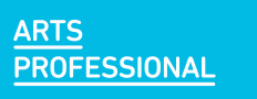
Our identity needed to reflect that we had become one from eleven, that we had simplified our processes and that we were even more accessible to our clients and stakeholders. After a tendering exercise, Lambie-Nairn were appointed as our branding agency. The solution was a subtle move in name from ?The Arts Council of England? to ?Arts Council England?, removing all the unnecessary words.
Having agreed our name we then developed a logo and a style which had to address a number of practical considerations. It had to work in a multiplicity of ways, be contemporary but not quickly date, to stand out and reproduce well in small sizes. It also needed to work alongside all artforms, work with partner organisations and not be culturally specific. As well as these considerations the logo could not overshadow the art it would work alongside. It could not be ugly or too distinct, to risk ruining arts marketing materials across the country.
Lambie-Nairn presented a solution in a text based, classically formed logo that works with a transparent centre, overlaying images of art. We selected a font, palate of colours and logo, but the most important part of our visual identity is its use with powerful images of art and arts practice. The hope is that the logo endorses the art and the art endorses the organisation. It also gives us an opportunity to promote the art we fund in our publications and materials.
We have been asked why it is important for an organisation such as the Arts Council to have a strong identity. For any credible organisation a clear visual identity acts as a symbol of what it stands for and supports clear communication. Additionally, the logo acts as a funding mark to demonstrate to the public where we spend their money. It is also a significant means of creating public support for funding the arts. This helps provide a foundation for our case for the arts to Government.
We went public with the new identity when we announced our ambitions for the arts in the next three years in February, at the same time we launched Grants for the arts, our new streamlined funding programmes. Since then we have announced how we will spend the money secured in the last spending round. We did so with our new single identity. Would this have been credible with eleven identities? Well it certainly wouldn?t have been cost effective with eleven different names and identities.
We can tell you how much the new logo cost, but wouldn?t know where to begin to calculate the long-term cost of printing 11 versions of everything we produce. So as part of the most radical reform of the funding of the arts in the last fifty years, we spent £70,000 on a new logo. The day after we launched there was press coverage about Transport for London?s £1.8m rebranding exercise.

Liz Martell is Branding Project Leader for Arts Council England e: liz.martell@artscouncil.org.uk